JOE CONNORS

VIDEO EDITING

GRAPHIC DESIGN

JOE CONNORS

VIDEO EDITING

GRAPHIC DESIGN

The Realized Release

What It Was:

Website rebrand and redesign

Who It Was For:

Life coaching program

Applications Used:

Framer, Photoshop, Dimension, WordPress

Client Since:

2019 – Present

I am currently undertaking a complete redesign of the website in Framer (which I used for this site as well). While I didn't write the copy, all other work on the website is my own. The client wanted to capture a sense of twilight – either dawn or dusk – in the design. Please feel free to peruse the staging site via the link below!

I am currently undertaking a complete redesign of the website in Framer (which I used for this site as well). While I didn't write the copy, all other work on the website is my own. The client wanted to capture a sense of twilight – either dawn or dusk – in the design. Please feel free to peruse the staging site via the link below!

The Realized Release

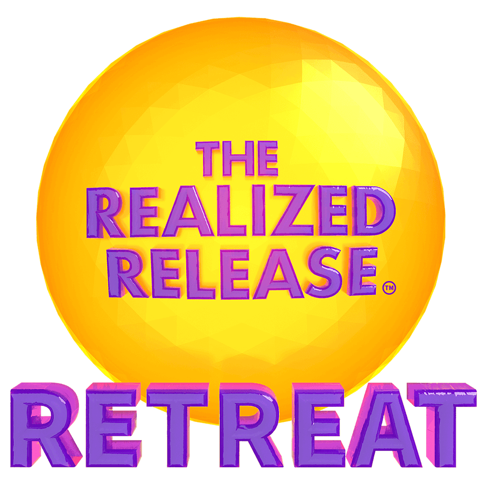
The client's initial idea for the logos was to capture the feeling of sunlight shining out from a gemstone. I went into Dimension and played around with geodesic spheres and jelly materials until they looked like jewels, then laid gold and amethyst lettering into the surface of each. The workshop logos feature fewer facets to imply their smaller scopes.

The client's initial idea for the logos was to capture the feeling of sunlight shining out from a gemstone. I went into Dimension and played around with geodesic spheres and jelly materials until they looked like jewels, then laid gold and amethyst lettering into the surface of each. The workshop logos' feature fewer facets to imply their smaller scopes.

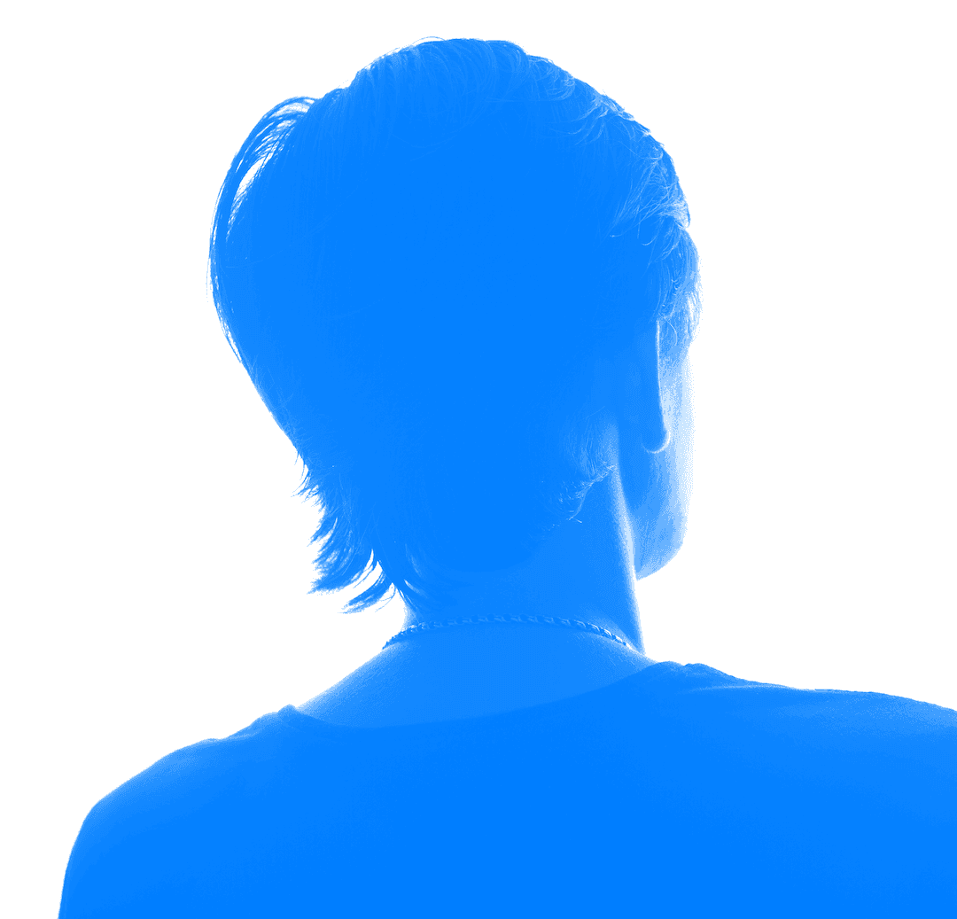
The aim here was to take silhouette stock images and flip their shadows into pure light. The client wanted the images to remain anonymous, allowing the viewer to see themselves in the images, while also leaving in all of the detail from these nicely lit images. I think they look like stained glass.